“Houston, we have a problem… with ugly content!”
Let’s be real: you may have the best, most groundbreaking, most insightful learning content in the world. Maybe it will guarantee everyone in your business a promotion, or save so much time that you can switch to a four-day working week, or finally solve world peace… but if it looks terrible, none of that matters. If your content doesn’t look the part, nobody will bother looking at it, so it’ll sit on your learning platform gathering dust, before it’s deemed a failure and quietly retired.
Learning that looks great is all part of creating better learning experiences. This ultimately means better engagement, knowledge retention, satisfaction, efficiency, time savings and much more - so how do we build learning content that combines style and substance?
How Greystar creates beautiful content
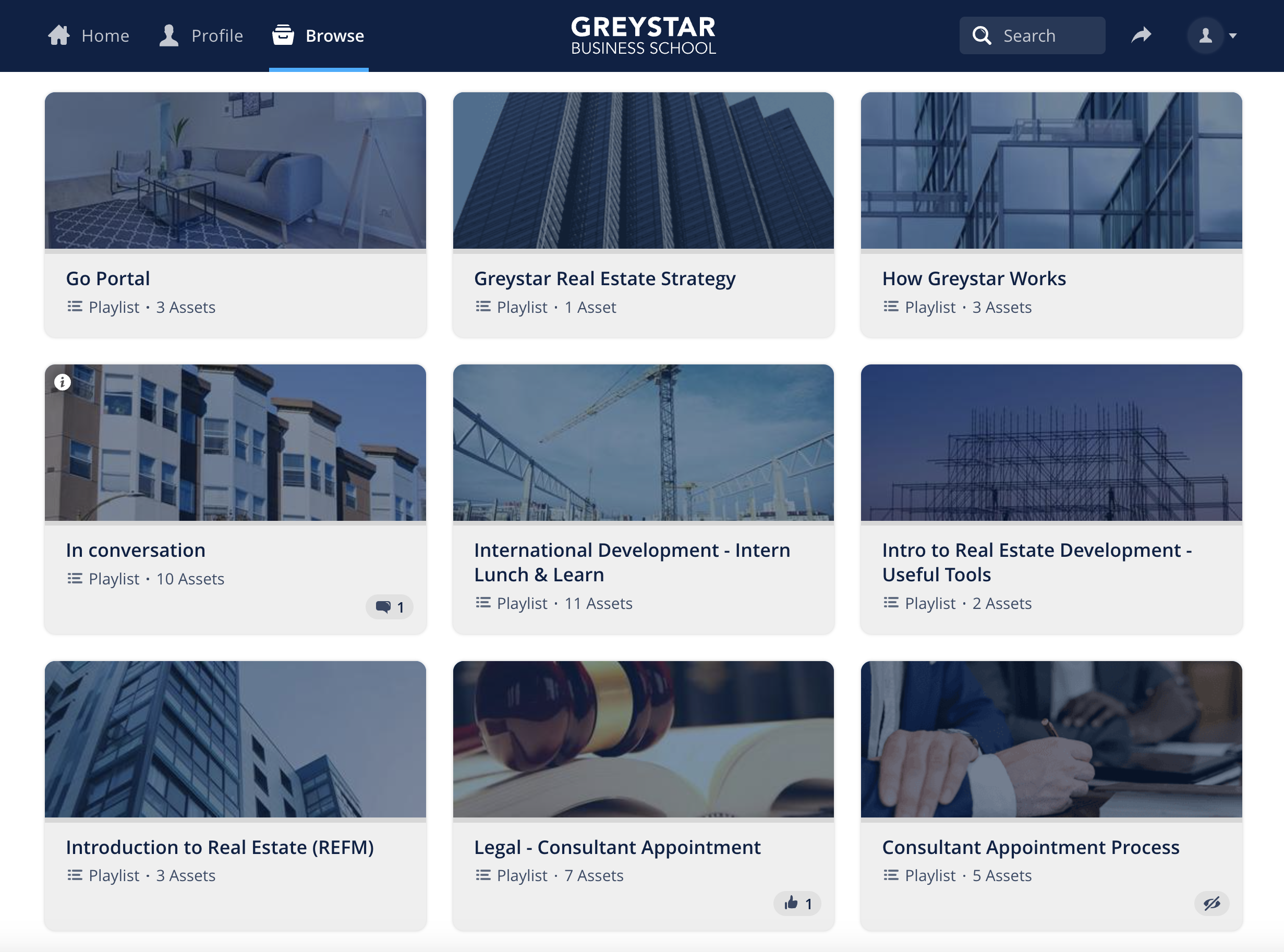
International real estate firm Greystar knew that choosing unattractive learning content just wouldn’t cut it, so it made the look and feel of its learning content a top priority. Greystar’s L&D team knew that the content itself was brilliant, so the visuals needed to match up to catch employees’ eyes and build trust.
In fact, there’s a lot of crossover between marketing learning content and content marketing as a whole. Your employees are most likely using Netflix, Spotify, Duolingo, Amazon, mainstream news sites and social media apps every day, so their expectations for digital experiences are sky-high - they expect consumer-grade quality even from their learning content. You may not have a Netflix budget, but that doesn’t mean you should ignore the role visual appeal has to play in boosting learner engagement.
For Greystar, that meant ensuring consistency across its entire content offering. It used off-the-shelf content by Hemsley Fraser, alongside its own in-house Greystar Originals, so the L&D team took care to ensure that every single piece of content uploaded onto the Greystar Business School adhered to high visual standards. If you, like many businesses, combine off-the-shelf and in-house learning content, make sure you have standards in place to maintain consistency and uphold your brand’s visual identity for the best results.
Simplify the complex

Of the 1,000 features and functionalities on your phone, how many do you really use? Data shows that the average phone user has 80 apps on their device, but consistently uses just 9, meaning almost 90% of apps are hardly touched.
It’s a similar story for learning content - a quick glance at your data should reveal how much of your content goes untouched every month.
More isn't always more
It can be tempting to load your platform up with more and more content ‘just in case’, but why make things more complicated than they need to be? In reality, lots of your content is probably ignored month after month, slowing your platform down and acting as a distraction to employees who just want to get in, find what they need and get out.
If this sounds like your company (and let’s face it, many of us are guilty here), it’s time to simplify the complexity for a better learner experience. Instead of hosting everything and the kitchen sink on your learning platform, think about whittling your content down to focus on quality over quantity. Specifically, identify gaps in your offering and cherry pick any content you add to avoid ‘content stuffing’.
You will also want to make it as easy as possible for your employees to find exactly what they need, when they need it. Recommended or featured content will help draw eyes to your most popular, useful resources, and themed playlists will help tailor content to your audiences, whether that’s by role, location, function or whatever makes sense for your company.
Finding the winning formula for learning content

We can all agree that high-quality, consistent content is key for securing high learner engagement and satisfaction rates... but what does that actually look like, and how do we get there?
When it comes to learning content, you should focus on:
- An attractive, on-brand look and feel (in terms of overall theming, graphics and copy)
- Intuitive navigation to boost ‘findability’ of content
- Minimising clicks to reduce friction
- Eliminating distractions from irrelevant content
Of course, the actual solution will look different for each company, based on your culture, branding and audiences, but we will all broadly take the same steps to get there. To find out what your employees actually want and need from their learning content, think about:
- Conducting user research and needs analysis (such as a focus group or a survey)
- Reviewing your data - who uses what, when, how and why
- Creating intuitive workflows and interfaces to minimise decision paralysis
- Constantly iterating on your content offering and how it’s presented as your business needs change
- Simplifying the complex, which starts with your tech
Everything you need, nothing you don't

Look, we get it. The temptation to throw more content at a learning problem and hope that this is the elearning course that finally fixes your business challenges. But as we all know, adding more and more assets to your platform is never the answer.
Instead, before you rush out to buy another batch of content, look first at optimising your current learner experience (or at the very least, take a deeper look at what you already have, and identify what you might need at a later date). Can people find what they need? Are there too many distractions on your platform? Does it take 15 clicks and a degree in computer science to find a simple step-by-step video on your platform? If so, it’s time to revisit that all-important learner experience, which can literally make or break your learning strategy!
Essentially, it boils down to giving your people everything they need and nothing they don’t… and perhaps most importantly, staying tuned into how people actually engage with your content and tech so you can pivot when you need to for the best possible learner experience.
.png?width=1920&name=Great%20user%20experience%20(1).png "Great user experience")